![]() With the big giants like Facebook and Twitter having already received a facelift in the last one year or so, could LinkedIn be left far behind? The world’s leading social networking forum for professionals has recently undergone a cosmetic facelift and it looks quite promising. Let’s take a look at how impressive these changes are.
With the big giants like Facebook and Twitter having already received a facelift in the last one year or so, could LinkedIn be left far behind? The world’s leading social networking forum for professionals has recently undergone a cosmetic facelift and it looks quite promising. Let’s take a look at how impressive these changes are.
Lasting Impression:
The first impression is that LinkedIn has definitely geared up to become more engaging. The user interface has seen some dramatic changes while retaining many features almost as it is. The most visible change is doing away with the additional white space that the previous layout had.
Additionally, LinkedIn has introduced a clear demarcation of the various elements of the page into sections for comfortable viewing and ease of access. A dash of blue, black and grey has been added to the menu bar at the top to give the home page a more dynamic look. This menu bar though floats around at the top of the page regardless of wherever one navigates to within the page. This makes navigation simpler and holds the attention of the people on the page longer.
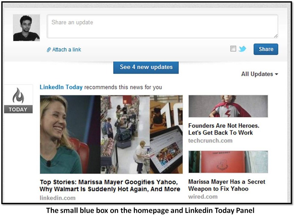
Also, in order to keep the platform dynamism quotient high, the new layout gives the user more updated information through his/her networks with the introduction of a small blue box at the top that keeps a score of updates in the real time; and they don’t stop at that.
Few of the sections to the right wing of the page give out clear numbers and statistics to an individual’s networking circle. The ‘who’s viewed your profile’ is the cue to discovering potential connections based on interest and an option to connect or message them is present, based on the degree of connection one has with that user.
Getting Personal:
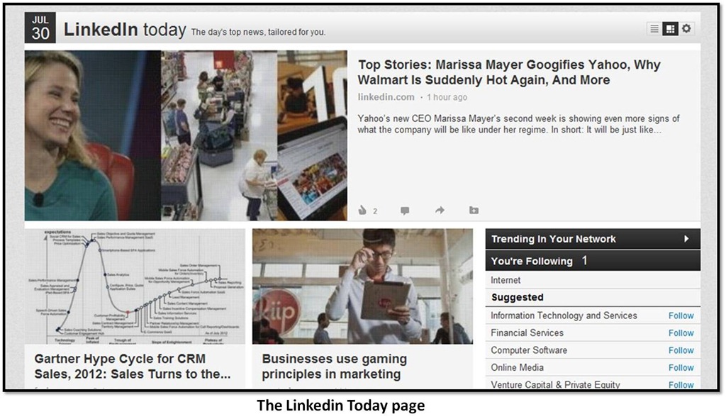
The most radical feature that now greets us as we land on to our page is the introduction of LinkedIn Today panel that acts as a storyboard for all the information or news feed that one would require. What this means is, there is more customized flow of information on the news feed that is virtually impossible to miss out. Add to that, the improved graphics and bigger images that utilizes the space with a photograph to supplement each story. What’s more? Just like Twitter, this feature enables user to be in tandem with the hottest trending topics in their professional network with suggestions to follow industries and customize news. We say, it’s a winning move indeed. Although we must add that the photographs of users in the feed could have used some better placement as the left edge has no margin space, which makes it appear to end abruptly on one side.
Linkedin’s Caroline Gaffney had to say this about the move behind these changes – “We’ve revamped the entire homepage experience with a new look and feel to make it easier to scan and find the information that matters most to you”.
So long, Twitter:
In extension of the same, another key feature that many experts feel will be instrumental in determining the course of LinkedIn is the much talked about fallout with Twitter. Previously, a lot of content that used to surface on LinkedIn was directed through Twitter and not all of them were relevant to the professional network. Twitter now has limited its API to prevent tweets from automatically posting to LinkedIn’s social network, which means the amount of effort and time that goes into sharing information across platform will go up. Such a move can be viewed with a double lens. It can either mean that people will get to LinkedIn and post content which would mean more relevant and platform centric posts. Or it could see a drop in engagement as not many would like to take this much of effort. The jury is still out on that.
What is your initial reaction to the changed layout of LinkedIn? Is it a better shift than what Facebook and Twitter underwent? Share with us your feedback in the comments section below. We are always happy to hear from you.

![clip_image001[4]](https://windchimes.co.in/blog/wp-content/uploads/2011/12/clip_image0014.jpg)
![clip_image003[4]](https://windchimes.co.in/blog/wp-content/uploads/2011/12/clip_image0034.jpg)
![clip_image005[4]](https://windchimes.co.in/blog/wp-content/uploads/2011/12/clip_image0054.jpg)
![clip_image007[4]](https://windchimes.co.in/blog/wp-content/uploads/2011/12/clip_image0074.jpg)
![clip_image009[4]](https://windchimes.co.in/blog/wp-content/uploads/2011/12/clip_image0094.jpg)
![clip_image011[4]](https://windchimes.co.in/blog/wp-content/uploads/2011/12/clip_image0114.jpg)