Archive for the ‘Social Media’ Category

Twitter takes a tweak

Monday, December 19th, 2011

twitter tweaks2011 has been a remarkable year for many startups and stalwarts in the arena of Social Media. For most part, the socially active would remember this year as the year of major changes being rolled out by most social networking sites.

Even the most popular micro blogging site, Twitter, underwent a major UI changes. The ‘New Twitter’ was launched amidst much talked about anticipations and apprehensions. Here is a look at how the tweaks make Twitter grow.

Navigation Keys

At the top panel of the newly refurbished Twitter, users have 4 easy to navigate keys which are essentially the Home, Connect, Discover and Me keys. Besides, there is also a Tweet icon that is omnipresent so that one can tweet no matter where they are on the page.

clip_image001[4]

Home

This is essentially where one views tweets from the people they are essentially following including their retweets. With the new twitter, photos, videos and conversations are embedded directly in tweets so that one can see the whole story at a glance.

clip_image003[4]
Image courtesy: www.fly.twitter.com

Connect

An easy conversation ready reckoner where one can initiate or continue conversations, see their RT’s, favourites, followers(these 3 clubbed under Interactions) and mentions.

clip_image005[4]
Image courtesy: www.fly.twitter.com

Discover

By far the most significant and distinct feature highlighted in the new twitter, discover aims to stream customized content and in most cases they are different for each user (Stories). Along with this, it has integrated the last rolled out Activity tab where one can keep a track on their followers, find friends from various mail portals, browse categories(according to the interest areas).

The Stories are visually presented with much revelry, aesthetically speaking. They highlight the name of the topic on the masthead where tweets regarding them can be viewed by a single click and are supplemented with a recent article on the same beneath.

clip_image007[4]

All about Me

The last of the tabs is a personal dashboard to the lists one has subscribed to/is a member of and an all new window to the Direct Messages which now appears in a separate window. The layout of the DM window is a lot more user friendly and packed. Clicking upon each interaction opens up a chat like window within the existing window with the latest messages exchanged appearing last.

The most prominent feature in the Me being the display and layout of the page that offers one to showcase to the world their identity. With an enlarged masthead where the profile picture is big enough to create a statement with enough space to key in an individual’s story. Not to leave out space to provide a link to one’s website.

This however, is one of the key benefits that Twitter Brand Pages would have in customizing there page layout.

clip_image009[4]
Image courtesy: www.fly.twitter.com

Also, when one gets’ to Browse categories, this is where the major development comes into foray. This is where most Brands would be interested and looking forward to. This is one stop shop for any brand or person with a public profile that are clubbed together in broad categories in order of their relevance. For e.g.: Sports, Music, Technology, Books, television etc.

Branded Tweets

Interface facelift and the potent mobile platform

Now that twitter has revamped its web interface with additional features, brands and users can exploit it like never before. Earlier high-powered twitter users made use of 3rd party tools like hootsuite, TweetDeck etc. which enabled them to manage their twitter presence because of elaborate and feature enriched interfaces. With the advent of the new twitter this trend is likely to get more users get hooked on to the web interface. The simultaneous launch of mobile apps also shows that Twitter is gearing up for the future.

Preemptive content curating

For brands, to build engagement it’s essential that they do a preemptive study on the nature of their followers. By knowing how their followers function could really work wonders. This way, the brands can think ahead of their followers and develop content that would have definitive response to.

The Activity tab has the Discover element under it. This lets the users and brand pages find out relevant content material that is in sync with their followers interests. This can subsequently be incorporated in their further dissemination of information/tweets.

The Brand Pages & Advertising

Twitter’s brand pages that were much anticipated has come with power packed features and is definitely a boost in the arm to woo major brands into the twitter ecosystem especially by integrating richer content and using paid advertising through its in-house developed advertising tool.

Last but not the least, as previously mentioned, brands could now use the page layout in doling out information about them in a much enhanced fashion. For e.g.: The mast head on top of the brand page has a huge space for bio and relevant/connected websites and makes for a promising stand out statement.

Also, the backgrounds could include more elements from the brand portfolio that defines it’s core fabric.

clip_image011[4]

The final tweet

Although it is still dicey as to how twitter would go about this, the content diggers on twitter will definitely discover twitter as a great reserve. As time rolls by and the brand pages gain prominence in the brandscape, the new twitter will definitely prove its mettle as far as effectively reaching out to consumers is concerned.

Catching the viral fever

Monday, December 5th, 2011

Viral-VideoYou would have had to be living in a different country to have missed the Kolaveri Di rage. Over the last couple of weeks, everything and anything seems to have led to this one piece of music video. From brand ads to political uproar and even a famous singer’s son making his version of the same, Kolaveri Di has had the spotlight firmly fixed on it. So what are viral videos? What purpose do they cater to? Here is an insight in to those videos that make the world catch a fever!


Prescription for a viral video

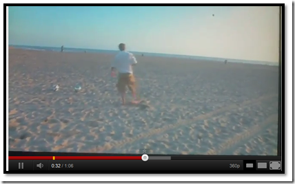
Viral videos are user generated content events, acts or largely ideas, made using a mobile device or any other video camera for simple consumption. The idea is to share the work on the web but the outcome is a huge buzz. This generally happens via multiple shares across various social networking platforms like the Facebook, Twitter, YouTube etc. thereby giving the content a cult status.

image

Click on the image to see the video

For most part, these are videos that are made without any direct intention of promotion. Many viral videos are simple homemade videos with animals, kids or even text and graphics. The insanely famous video ‘charlie bit my finger’ and the sequel, ‘charlie bit my finger – again’ that spawned off based on the popularity of the original one that was released on May 22, 2007 rose to the charts with an astonishing number of views (389 million as of November 2011) and people are still viewing that.

image

Click on the image to see the video

But a lot of these videos are brand backed. Although, while launching the video, the brand is generally underplayed. It is only when the buzz builds up and has caught enough eyeballs that the brands start claiming their success.

image

Click on the image to see the video

What’s making the temperature rise?

For any 21st century marketer, it becomes crucial to tap onto any medium that assures the brand presence is reverberated across various target groups. An increased visibility or mind-space is the first step towards selling any product/service today. With an increasing number of people who are getting added to the digital world each passing minute, the database of prospective buyers are on a parallel rise.

Traditional mediums like TV and radio are not just making a cut primarily because a major chunk of those who used to spend time on these mediums have migrated to the virtual world. The average time an urban dweller (not only restricted to metros) spends on internet today is much higher than what he spends in front of a TV or while listening to the radio. Also the cost of making such videos would be a fraction of what an ATL campaign would cost.

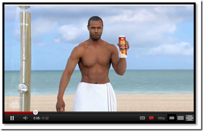
An incredibly successful viral video campaign is that of ‘The old spice man (Perez Hilton)’. The video has the main character talking to women about, ‘the man their man could smell like’. Within no time it started going viral and it reached to such heights that the same concept was carried forward as commercials.

image

Click on the image to see the video

Season for viral

In most cases there is no definite time when a video should be uploaded. The thing about a video going viral is that if it’s properly edited with enough good content to keep eyes glued to it, chances are that it will in due course gather decent views. Of course there are few videos which are event and time specific that are released to maximize the benefit of prevailing crowd sentiment.

A clear example of the same was the video leaks of the chammak challo song from the film RA.One. People were already waiting to see how international superstar Akon would sound singing a Bollywood song when the video hit the social media platforms. And within hours, the video had garnered thousands of views. The fact of the matter is that although there is no foolproof time that can assure a video going viral, carefully releasing one in tandem with a stirring event can spell wonder for brands.

RA1

Click on the image to see the video

It’s getting hotter

Although there is no hard and fast way to determine what will become viral, a simple idea that lets the viewer have an insight to some really interesting, entertaining or unseen footage will make the cut. There is no upper limit to the viewership that a viral video can achieve as compared to the ad spends that a brand is restricted to.

Combine this with the number of people who are getting on to these platforms and the further rise in users through mobile phones presents an incredible scope for brands to invest in viral videos. They not only come across as spontaneous but also are far more entertaining than a typical tvc.

While the fact remains that not everyone who uses internet would have plausibly view it, chances are that they would’ve heard a mention or two. That’s what internet does right? Spreads information like a wildfire.

Google+ lures the brands, finally!!

Monday, November 21st, 2011

Google_plus_logo_thumbAfter much anticipation, Google finally allowed brands to create their pages on Google+ social network earlier this month. With lots of pre-launch speculation as to features, functionality and the impact Google+ Pages for brands could have on search and on Facebook pages, many brands will surely be very very excited to make their presence felt on the latest social media platform. An early adoption may boost the brand numbers in short run but a close look is a must before diving in.

While it will be essential that brands make the most of the functionalities and features available to add something new and fresh to their social media user experience, emphasis will also be on the way they integrate their approach to social media and SEO which would be a very important element of Google+ pages.

Impact on brand search

Knowing Google, it would have been hard to believe that they would not have used their core product to jump start the Google+ page promotion. Google search is the single largest provider of information on the net today and not using it to its benefit would simply not make sense. Thus, the new Direct Connect feature – a feature that will enable users to search for brand pages within the Google search page by simply adding ‘+’ before their search has been established. This not only gives a great boost to the brand page but also thumps Facebook page search abilities which are far more complex.

  search
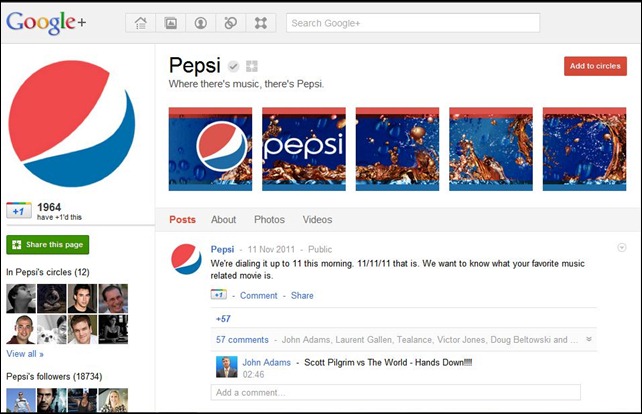
Google Search for a Google+ page of Pepsi

Also, the tie-in between +1’s and brand page content will be a very important search engine optimization tool now. It is widely thought that content receiving +1’s, whether this is inside the Google+ platform or indeed on a brand’s own website, will appear considerably higher in organic searches. Additionally, when a user is logged-in to their Google+ account, Google also takes the +1’s of both the user and their connections/circles into account when delivering the search results it serves to users. Essentially, Google is assigning weight to social recommendations through Google+ as a metric of content quality and relevance to the user, making search results more personalized in a way we have not seen before.

The clean and clear advantage

The Google+ page retains a very bright, big colorful layout. It feels less “narrow” than Facebook, and one does not have to scroll down so much to see previous conversations. This makes photos a lot easier to view, also, with an easy-to-spot conversation bubble to notify which photos had comments attached to them. There’s just something about that clean design that is a breath of fresh air from the ad-and-content-cluttered Twitter and Facebook.

Page
A clean and crisp page layout

On first look, Google+ brand pages may look remarkably similar to the layout we have come to know and love on Facebook. However, it is in the additional visual features available beneath the surface where things start to come to life on Google+. Like the dynamic profile pic option that changes every time you click on it or the animated header profile picture gallery, Google has added stuff that are nice and pleasant on the eye.

Another Wave

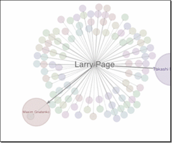
Google wave may have died but Google has introduced Ripples! It shows, in a web diagram, how a content piece has been shared, who are the main influencers on the page, and other fascinating statistics that one can’t find anywhere else.

clip_image002
Google Ripple

This helps in making the page a lot more convenient and easier to interpret. Add to this, the Hangout feature will surely help bring down the gap between the brand and the people who follow it. A direct interaction with those who run the brand will only serve to establish a better relationship.

Not yet there

While a direct connect and a straight link to YouTube will add to Google+ pages advantages, the lack of APIs will hurt as much. Facebook was not just a standalone platform. It was a ground to work on. It has helped make industries out of game makers and application developers. How Google+ pages counter that is yet to be seen.

Also, the strict policy of not allowing and contest or promotion on the page is a hurdle. One cannot ignore the fact that promotions and offer are key to social media marketing in our region. Thus, while it makes sense to give Google+ a thought, a wait and watch approach may give a clearer picture to the brand managers.

Click here to read more about Google +

Insight in to new Facebook Insights: Part II

Tuesday, November 1st, 2011

Insight in to new Facebook Insights Part I


Continuing our discovery of the new Facebook Insights, we would now look at growth measurement tools that have been incorporated.

Section 3: Growth Measurement

3.1 Like Sources

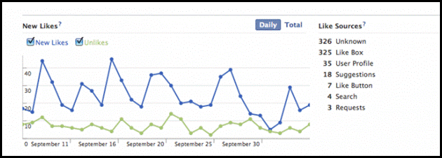
Facebook included Like sources in the previous iteration of analytics, but this is now more advanced. This number used to be fairly arbitrary as organic Like sources within Facebook were simply expressed as ‘unknown’:

clip_image002

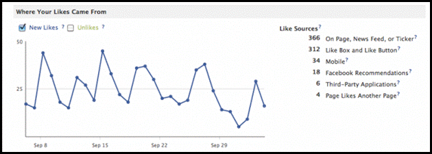
This has now been expanded upon to give a much more accurate view of how people are not only finding the Page, but also how they Like it. Importantly, this is split down for the different functionalities within Facebook. So, for example, one can now see how many Likes the page is getting as a result of another Page posting a link to the brand Page :

clip_image004

3.2 Demographic Reach

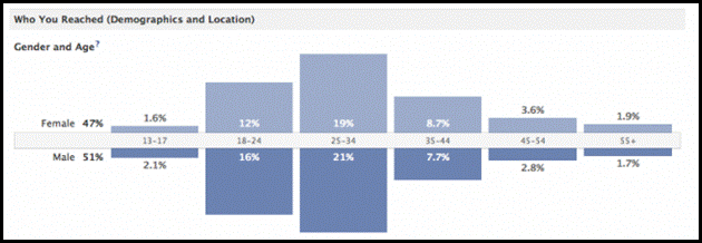
While Facebook offered access to the demographic breakdown of fans, now it gives the admins the ability to see the demographic breakdown of active fans. This shows information on age, gender and location for anyone that was exposed to the content, whether they are a fan of the Page or not. As this gives a more accurate indication of who is actually engaging with the content, one might find that if the demographic breakdown here is different to the demographic breakdown of the fans, then you need to adjust the content to better suit these engaged fans.

clip_image006

3.3 How you reached people?

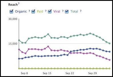
This graph will allow admins to plot different visits to the Page based on how people were exposed to it. That is to say that if most people are finding the Page through ads, then there is a need to improve the organic content.

                               clip_image008

3.3.1

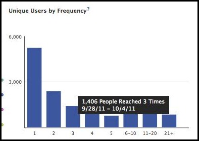
Another insight is ‘unique users by frequency’ that gives the average number of times someone engaged with a piece of content. So, for example, one can now see how many people were engaged with your content once, versus the number of people who were engaged with the content 3 times. This counts people that viewed the content, as opposed to commenting or Liking for example.

                                clip_image010

Verdict:

Overall it seems that Facebook has really jazzed up their insights with tools that give more or less a complete picture of the expanse to which the page admin can monitor developments without having to rely on external softwares. The various new tabs, sub tabs and sections introduced give a real time happening about the brand’s engagement with not only its primary audience (users) but the secondary audience too.

This development also means that as an owner one can gather various data and analytics and determine the course of the page. What kind of content is a hit with the users, what’s not, what will perhaps be received with much enthusiasm, by whom, how etc.

With features such as the Timeline and Subscribers already gaining popularity, carefully integrating the insights with these could only spell wonders for brands. Of course, it does not take away the fact that it becomes a little too complicated from a strategic viewpoint and the results are yet to be seen.

Insight in to new Facebook Insights: Part I

Tuesday, November 1st, 2011

Facebook Insights had always been a handy tool for page owners irrespective of the size they command. It always provided information about how to make the page even better. Last month Facebook launched a new version of Facebook Insight. Many had speculated it to be a paid service, but so far Facebook is not charging anyone. Here is a look at how the insights have evolved.

Section 1: Reach Measurement

1.1 Friends of Fans

Facebook advertising provides the option to target friends of fans. Essentially this means that the ad will only be shown to friends of people already on the brand page. Now through Page Insights, one can see the total reach of ‘friends of fans’. This is an important number to keep an eye on, as it will ensure that when someone engages with a piece of content on the Page, their friends are being alerted to it. It gives a more accurate reflection of your ‘ambient’ audience. i.e. those who might not be fans of your Page themselves (as this number excludes current fans) but who may have been exposed to your message :

clip_image002[6]_thumb[2]

1.2 People Talking About This

This is the most hyped feature that Facebook has introduced. It gives a figure, for the time period that one selects, of the number of times a post was generated about the Page, including links in personal profiles, or posts in which the Page has been tagged in.

clip_image004[6]_thumb[2]

Within this new metric, one can see a demographic breakdown of people who are talking about the Page by age, gender and location. One can also compare the viral reach (the number of people who saw your Page), compared to ‘talking about this’ (the number of people who actively created a story). As reach just takes into account people that were exposed to your content, this figure will always be a lot higher than those people talking about it. Individual ‘story’ can be compared, for example the number of times someone tagged the page in a post or photo:

clip_image006[6]_thumb[2]

1.3 Weekly Total Reach

Earlier for a post on Facebook Page one could see the individual number of impressions, but not the cumulative total. Now Facebook has introduced a feature that gives the weekly total reach, which is the number of times someone has been exposed to the Page, either through a post, a friend commenting, or through an ad. One can see the percentage change over time, thus, if there is increase in fans but the reach is going down, brand may need to think about creating more engaging content, so as to grow organically:

clip_image008_thumb[2]

Section 2: Post Insights

2.1 How viral is a post?

Facebook ranks the posts in order of engagement, as before, but this has been massively expanded on. Now, ranks also show a number of different metrics, which cover : Reach (the total number of people that saw your post) ; Engaged Users (people who interacted with the post in some way, such as clicking on the post in their newsfeed or leaving a comment) ; Talking About This (the number of people who have created a ‘story’ from your post, such as leaving a reply or sharing with friends) and Virality which is slightly more complex. The ‘virality’ of a post is expressed as a percentage of people that created a story about the post, against the total reach. Seeing the posts in this way allows brands to see the content that clearly worked, or didn’t work:

clip_image010_thumb[2]

2.1.1

One can then expand on a particular figure, to get more detailed insights. Clicking on ‘reach’ reveals a breakdown of whether that reach came directly from your Page activity, Facebook Ads, or whether it was viral (fans generating stories)

clip_image012_thumb[2]

2.1.2

Clicking on ‘engaged users’ shows: Other  clicks (clicks on other parts of the post, such as the name of the person that posted it) ; Link clicks (the number of clicks in a link on your post) ; the number of stories generated from the post, by fans :

clip_image014_thumb[2]

2.1.3

Clicking on ‘talking about this’ allows people to see whether these stories generated were someone who likes the post or sharing it:

clip_image016_thumb[2]


Click here to read part two of this post.

Social Universities

Saturday, October 15th, 2011

The question about digital technology and its place in academia is one that is yet to be clearly answered. Understanding the benefits and costs of using digital technology is crucial when deciding if a particular tool, site or package may be used in universities.

              Harvard Twitter

Harvard University Twitter Handle

Universities are constantly exploring new ways to use social media to fulfill their missions of engaging and sharing knowledge with their constituents. Here we look at few ways in which universities can use social media without distracting the students.

Reaching out to the world

Social media tools like Facebook Pages have given universities an opportunity to speak to audiences on their own, reaching thousands of people interested in keeping up with news at the school and connecting with others on the social network.

                    Reaching Out

Insight to the campus life

Perhaps the most common way, and the way in which most of us use social media, is sharing information about ourselves or things we find interesting. Because universities are educational institutions, they use social media to highlight their experts, as well as the resources they make available to the public/student. The point is to try to educate and provide a glimpse into what the institution is like.

               Highlighting

Showcase work

Aside from sharing news and information, social media is often used in showcasing student and faculty work. That can be as simple as featuring photos taken by students through a photo album on the university’s Facebook page. Or it can take the form of an elaborate YouTube video by students as a class assignment. The idea is to let the general audience know what kind of work is being carried out in the university.

               Showcase

Getting Innovative

Rather than just use social media to promote specific events, some universities employ the tools to provide a place for the university community to engage and participate in the event as it is happening. This can be done through live streaming videos or collecting tweets during commencement through a common hashtag. This allows students and others to report on the event happenings as if they were being attended.

  3tag

Hashtag Communications

Emergency Service

Emergencies and tragedies do happen. With the growing popularity of social media tools like Twitter, some universities are finding it easier and quicker to spread news during an emergency by complementing their e-mail and text alerts with a Tweet and a Facebook message or post. The University of Minnesota has an Emergency Notification group on Facebook that it uses to blast messages to its 2,300 members during a case of an emergency. It provides another way to reach students who spend a lot of their time there during critical situations.

Alumni Relations

Another key element of using social media is to keep the alumni body connected. With ever growing number of students passing out each year, keeping up with everyone becomes a task. Universities have utilized the services of groups and pages to get the alumni members stay connected. This not only helps connect various batches, it also gives opportunity to draw on resources that may be readily available to the university through its ex students database.

                    Alumni Relations

Providing Jobs

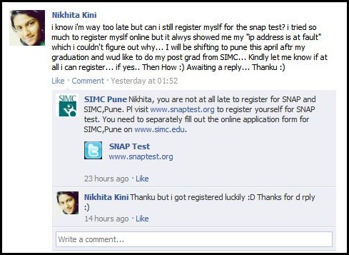
The key element of Universities is to provide jobs to the students. Some universities have used the social media platform to source out placements for students through the alumni members. Alma Mater is the best starting point for placements and a connected alumni cell with placement cell has made job search that much easier. The secret groups of Facebook seems to be a very popular tool not just to get fresh offers but also to source out the best job change for the members.

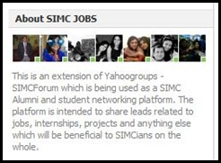
                   SIMC Jobs 2SIMC Jobs 1

Job Forums

The benefits of social media to help students search for information, learn to communicate effectively and work collaboratively are well documented. There are resources to help academics consider the advantages of using social media in universities. They provide advice on using blogs, social networking sites, social bookmarking, collaboration, presentation and information management tools, and more for academic purpose. All it needs is for the universities to cease the opportunity and use the tool in the best possible manner.

Facebook becomes a year book

Monday, October 3rd, 2011

Facebook has made a radical change to its user interface- the first since the launch of Google +. While it would take some time for the entire gamut of changes to make a marked difference to our experience, let us peep under the hood, at how the Facebook is set to change.

Timing the changes

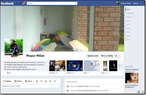
The most striking feature is the new Timeline, a chronological layout of the profile/page which shows everything that the user/page has done since getting on to Facebook. It is a more simple and efficient way of checking out a profile or a page. The interface itself is far neater and clears a lot of clutter. One interesting feature is that now a lot of options have been put in a drop down rather than a separate button.

            clip_image002

Each friend is important

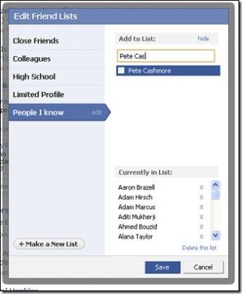
Facebook has also introduced new friend lists, which is an optional feature, and is essentially a redesign of a feature it’s had for years—Lists. The original Lists were difficult to navigate and tedious to update, which was the reason for the revamp. If you choose to activate the lists, Facebook will generate four separate lists for you: work, school, family and city. Facebook puts people into these lists based on information they have in their profile. For example, if you list Harvard University as your alma mater, and so do 25 of your Facebook friends, they will be grouped under "school." In addition to this you also get two lists that you curate on your own to distinguish close friends from people you don’t know well.

                                   clip_image004

The news maker

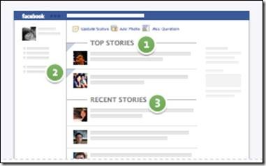
Before these changes, when you logged into Facebook you could toggle between two views of your News Feed: Top News and Most Recent. Now, Facebook combined these two in a single News Feed. Now, what you see when you first log in depends on how frequently you log in. If you don’t visit Facebook regularly, the next time you do you’ll see top photos and status updates that were posted since the last time you visited the site. These are marked with a blue corner. If you log into Facebook frequently, such as several times a day, you’ll likely see the most recent stories first.

                               clip_image006

1: Top Stories 2: Side Panel 3: Recent Stories

News keeps trickling

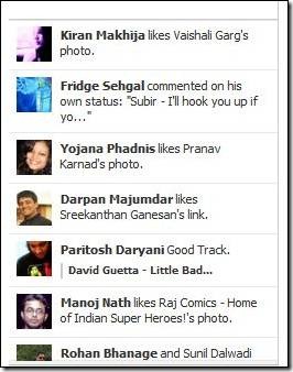
Another addition to the system is the Ticker. This is a smart move as all the updates which are not direct interaction with an individual will show up here. Thus, clearing the wall for more direct status updates and relegating your friends Farmville exploits to the ticker. Furthermore, note the updated photos. New Facebook interface is now enlarging its size so it looks more clear and comfortable to view while users navigate and have fun.

                                              clip_image008

Know more than just friends

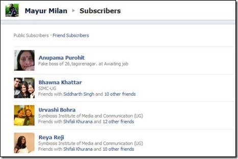
Subscriptions, another key feature launched recently, lets you see people’s public posts in your News Feed, without having to friend them. And while Facebook Subscriptions is an interesting way to broaden your network and connect with people you otherwise wouldn’t have contact with, it also gives people who had a page and a profile to merge it.

                      clip_image010

The Verdict

The changes are intended to help you keep up with people that matter to you, regardless of how often you visit the site. The new Timeline interface is beautiful and a major time sink. Overall, Facebook has made profiles more personal. Users are going to be spending hours in their friends’ Timelines. The addition of the Cover Photo makes the Facebook interface more beautiful, and the timeline is easy on the eyes. While it will take some time to get used to the two-column layout, it actually is easier to navigate than the old Facebook. Facebook thought hard about the design of this change.

As a business entity, this means more display space for the brands. The cover photo can actually be used as banner ad space for which they won’t have to spend anything. Also, with expected time spent on Facebook going up, it can only be good news for the brands. What is most interesting though is the fact that Facebook seems to be quite sure of the changes and that could be a worry for Google.