Facebook has made a radical change to its user interface- the first since the launch of Google +. While it would take some time for the entire gamut of changes to make a marked difference to our experience, let us peep under the hood, at how the Facebook is set to change.
Timing the changes
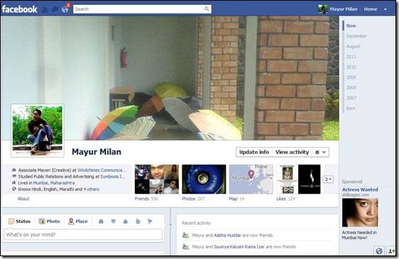
The most striking feature is the new Timeline, a chronological layout of the profile/page which shows everything that the user/page has done since getting on to Facebook. It is a more simple and efficient way of checking out a profile or a page. The interface itself is far neater and clears a lot of clutter. One interesting feature is that now a lot of options have been put in a drop down rather than a separate button.
Each friend is important
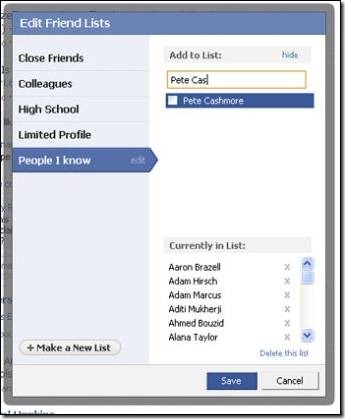
Facebook has also introduced new friend lists, which is an optional feature, and is essentially a redesign of a feature it’s had for years—Lists. The original Lists were difficult to navigate and tedious to update, which was the reason for the revamp. If you choose to activate the lists, Facebook will generate four separate lists for you: work, school, family and city. Facebook puts people into these lists based on information they have in their profile. For example, if you list Harvard University as your alma mater, and so do 25 of your Facebook friends, they will be grouped under "school." In addition to this you also get two lists that you curate on your own to distinguish close friends from people you don’t know well.
The news maker
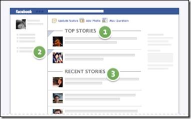
Before these changes, when you logged into Facebook you could toggle between two views of your News Feed: Top News and Most Recent. Now, Facebook combined these two in a single News Feed. Now, what you see when you first log in depends on how frequently you log in. If you don’t visit Facebook regularly, the next time you do you’ll see top photos and status updates that were posted since the last time you visited the site. These are marked with a blue corner. If you log into Facebook frequently, such as several times a day, you’ll likely see the most recent stories first.
1: Top Stories 2: Side Panel 3: Recent Stories
News keeps trickling
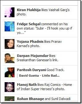
Another addition to the system is the Ticker. This is a smart move as all the updates which are not direct interaction with an individual will show up here. Thus, clearing the wall for more direct status updates and relegating your friends Farmville exploits to the ticker. Furthermore, note the updated photos. New Facebook interface is now enlarging its size so it looks more clear and comfortable to view while users navigate and have fun.
Know more than just friends
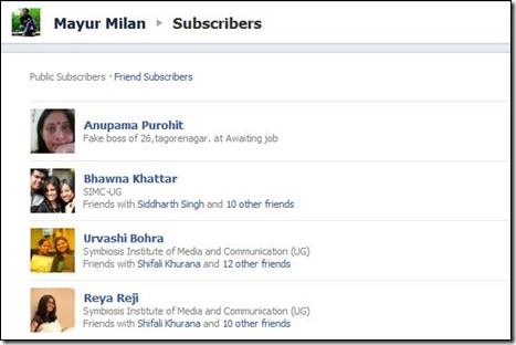
Subscriptions, another key feature launched recently, lets you see people’s public posts in your News Feed, without having to friend them. And while Facebook Subscriptions is an interesting way to broaden your network and connect with people you otherwise wouldn’t have contact with, it also gives people who had a page and a profile to merge it.
The Verdict
The changes are intended to help you keep up with people that matter to you, regardless of how often you visit the site. The new Timeline interface is beautiful and a major time sink. Overall, Facebook has made profiles more personal. Users are going to be spending hours in their friends’ Timelines. The addition of the Cover Photo makes the Facebook interface more beautiful, and the timeline is easy on the eyes. While it will take some time to get used to the two-column layout, it actually is easier to navigate than the old Facebook. Facebook thought hard about the design of this change.
As a business entity, this means more display space for the brands. The cover photo can actually be used as banner ad space for which they won’t have to spend anything. Also, with expected time spent on Facebook going up, it can only be good news for the brands. What is most interesting though is the fact that Facebook seems to be quite sure of the changes and that could be a worry for Google.

