 So the timeline for brands is finally here. After months of speculation about what all will it bring with it, we now know that the platform is all set to undergo another major shift in communication pattern. Emphasis will now be on visual creative and storytelling. We analyze the changes that the platform will see in this article.
Getting Covered
The most noticeable change that anyone would see is the huge space that is going to be available right on top of the page to put up a cover photo. The size of the cover photo is 810×350 pixels. In a way, this is the largest available space that Facebook has ever given a brand to reach out to their audience.
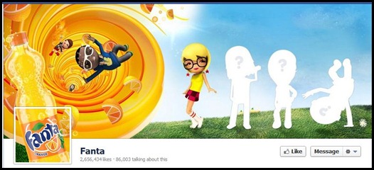
Cover Photo (click on the image to enlarge it)
While this is a big real estate for advertising, Facebook has not allowed brands to have any calls to action in your cover photo. You can’t tell people to like or share your page or have any contact information at all, including your web address, phone number or mailing address.
The highlight of the change
The timeline has also brought about a major alteration in content distribution. The content is now spread in to two columns rather than one single stack up. This means a side by side post will let you prolong your post life a little bit longer than before. Also, all post by people on the page gets segregated into one block which comes on the top most part of the right column.
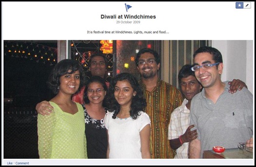
Highlighted Post (click on the image to enlarge it)
Not only that, like with cover photos, Facebook has now given you the ability to emphasize your story telling with bigger picture. So now, if you want a particular post to garner more views and appear more striking on the page, simply highlight it and the image and the post will spread across the two columns of the page, giving you one big eye catching post.
On pins and needles without landing tab
Yes. You read that right. The landing tab has been eliminated from the new design. The face of the campaign pages, the launch page for competitions and application does not get a look in the new design. What you do get instead is a pinned post.
Pinned post is nothing but a normal post, ideally with a campaign launch creative, which can be pinned to the top of the page. Through this option, this creative will get the top post slot for a period of seven days. The idea is that while you may not be able to get people to land on a particular tab, you can make them notice the main campaign first up. The pinned post comes with a small orange tag on the right top corner.
This could have been put up on the cover page but then with cover page restriction of no call to action and no communication, that idea gets tossed out. Thus, this makes the pinned post the only alternative for a landing tab.
Every milestone counts
Facebook has always wanted people to document their life by sharing posts, videos and photos. Even relationships and friendships are highlighted in the personal profile. That is what Facebook has brought to the brand timeline.
Documenting the progress of the brand through milestones. The day the brand came in to existence, that new office, the 100th employee or the letter of appreciation from a famous customer. Facebook wants the brands to narrate those things to its audience. Make it more human than ever before. Audience of the page can directly navigate to a particular year via the timeline.
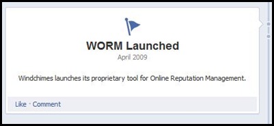 This is quite literally, Facebook’s way of telling the brand managers to stop worrying about the numbers on the page but building a strong brand. Bring out the history and the emotions associated with the brand before you go looking for the ROI.
Tab dancing
With the new two column layout, the new tab has lost out majorly. The list of tabs and application that was there below the profile picture now gets lost. And almost become invisible. Though they have been moved right under the cover photo, there is a restriction of only 4 tabs to be visible while the rest get demoted into a drop down.
Amongst those 4 visible ones, the first one is always going to be that for photos. That leaves only 3 visible tabs for your competitions, applications, likes, notes and all that you want to do. So what will be needed is a more planned approach to launch of applications and campaigns. Making sure that there is no overlap so that each campaign can get a proper display in the tabs.
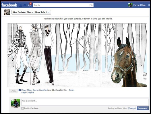
New Tab Size (click on the image to enlarge it)
Once on the tab, the creative space that the tab gets is now 810 pixels as compare to 510 before. This means there is a lot more space for you to put images and copy. A good brand would use this intelligently.
The Backend
Another change with the Timeline is the location of the Insights. You can now access them by clicking on the Admin Panel in the upper right corner. The Admin Panel has much different navigation than before, but everything appears to be there. From the Admin Page, you can also invite your email contacts, invite friends, share your page and create an ad from the Build Audience drop-down menu.
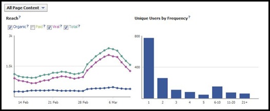
Insight (click on the image to enlarge it)
One of the capabilities will be to easily request a name change for your page. This name change is the title of your page, not the custom URL you may have set for your page. Great news for people who have changed their company branding, have had a misspelling in the name or have other tweaks they have wanted to make.
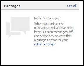
Pages will also have the ability to receive messages from fans. The Message feature can be turned on or off from the Manage Permissions area of the Admin Dashboard. Messages can only be initiated by a fan—they cannot be initiated by the page to a fan. The page can reply to the message sent.
Reaching Out
The ads have got a makeover. They will be larger and come in form of Reach Generator and Premium on Facebook. The Reach Generator is designed to reach more of your existing fans than you currently are reaching through the news feed. Premium on Facebook is designed to distribute your stories to new connections and will be shown on the right side of the home page, in the news feed, in mobile streams and when someone logs out of Facebook. Beta testing has shown that the reach for these products through in line feed push can go up to as high as 80 to 90% of total estimated reach.
With Reach generator, the posts on the wall will be used to reach the audience. That means a higher engagement can be expected through this paid mechanism. This makes the job of page admin that much more important as s/he would need to decide which post should be best used for such a campaign.
In the pipeline
While these are the major changes that have happened as of now, few more features would surely be added in the new system soon. This includes Facebook offers. Facebook Offers are like Facebook Deals on steroids. The post is sent through the news feeds of your fans, which is much more visible. There are easy ways to share the Offer, both through the post itself and then when the Offer is claimed. Fans get the Offer by clicking the Get Offer link
Fan Gating, another standard feature in pre timeline era used to get people to like the page, is currently missing. This is something most experts believe will soon be brought back since it forms a part of loyalty program.
Changes to Facebook have always made brands nervous along with their agencies. But this time around, the nervousness is more about the things that have been dropped out rather than the ones that have been added. But it is clear from all these changes that Facebook wants the brands to build brands on its real estate rather than sell.
Comments
Tags: Cover Photo, Facebook, Social Media, Timeline


[…] organic fan growth through these campaigns has been observed. 102 fans were added on the Facebook page. We believe that a brand has to be smart and willing to engage with its audience on topics that the […]